Pfizer
Creating a masterbrand website
Overview
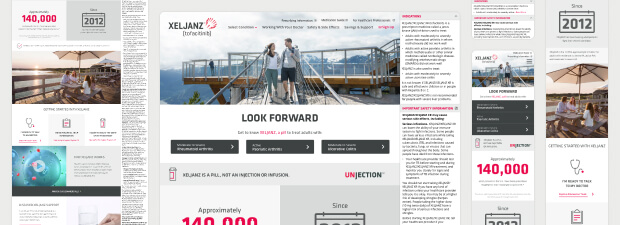
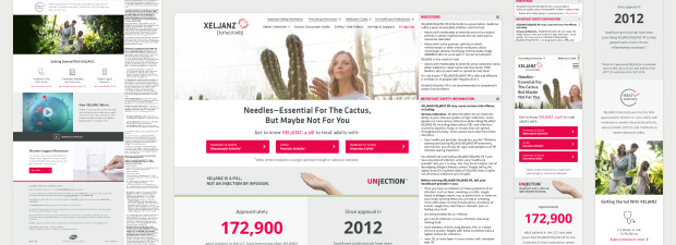
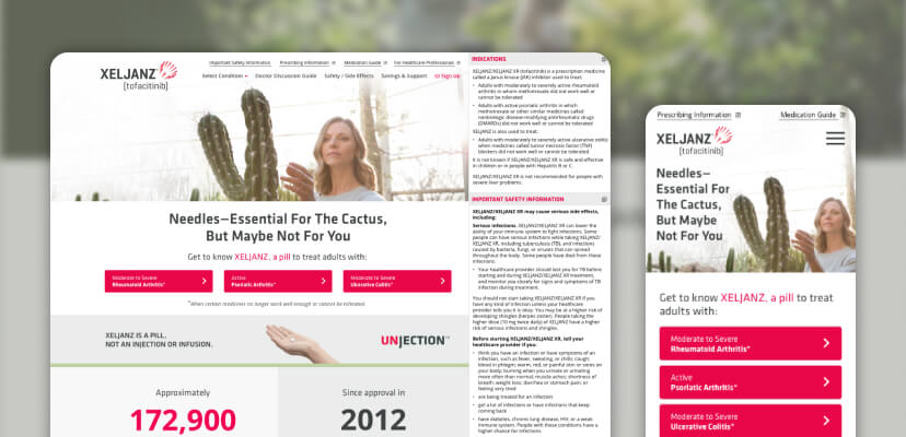
Pfizer’s XELJANZ website ecosystem was fragmented across multiple subdomains, resulting in a disjointed experience for patients, caregivers, and healthcare professionals. My challenge was to lead a full redesign and consolidation effort that delivered a modern, user-centered, and compliant masterbrand site for XELJANZ—aligning business needs with regulatory processes and improved usability.
Challenge
The XELJANZ web experience was spread across three separate sites, each targeting different audiences with overlapping or duplicated content. This approach led to:
- Inconsistent UX and branding across touchpoints
- Regulatory bottlenecks due to siloed content review
- High drop-off rates during registration and form flows
- Outdated design patterns not optimized for mobile or accessibility
- Inefficiencies in design-dev workflows
Opportunity
By unifying the XELJANZ experience under a single masterbrand framework, we were able to:
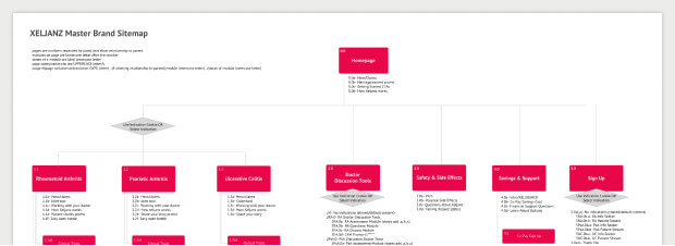
- Consolidate content and streamline site architecture
- Modernize UI/UX informed by user research and analytics
- Build a design system aligned to brand and regulatory needs
- Introduce new tools and processes to enhance collaboration and consistency
- Reduce form abandonment rates and improve sign-up conversions
Role
As Design Director, I owned the full end-to-end experience:
- Oversaw UX strategy, research, and design execution
- Facilitated collaboration between product, dev, and regulatory teams
- Championed a product mindset and scalable systems thinking
- Trained team members in new tools (Sketch + Abstract)
Research and insights
We combined user research and analytics to understand pain points and identify high-value user pathways—specifically targeting increased CRM registration rates, our core KPI.
Opportunity #1
Perceived Bias in Pharma Content:
Users mistrusted the objectivity of content. We improved content strategy and navigation to give users more direct access to what mattered most to them.
Opportunity #2
Cognitive Overload in Forms:
Overly long and complex forms were hurting conversions. We streamlined the experience into dynamic, multi-step forms that responded to user inputs in real-time.
Wireframing & UX Strategy
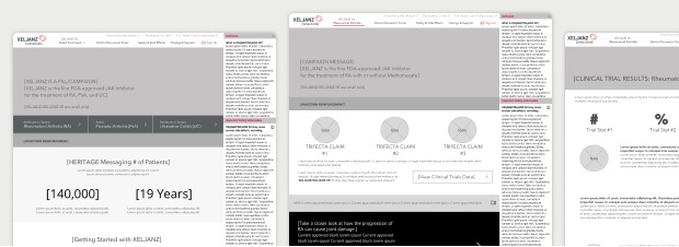
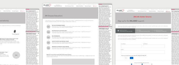
We defined a clear content hierarchy and refined the user journey across all pages. Key improvements included:
- Prioritizing critical pages and simplifying navigation
- Introducing in-page navigation for lower-priority content
- Reducing a 6-page sign-up flow to a 1-page dynamic form
- Mapping end-to-end user pathways for consistency and efficiency
Visual design
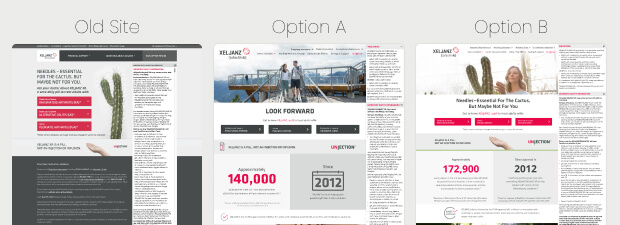
Using brand guidelines and research-backed wireframes, we explored multiple visual directions for key pages:
- Incorporated existing photography, illustration, and iconography
- Created two distinct visual hierarchies for stakeholder review
- Designed and grouped pages into sprints for iterative feedback cycles
- Used Abstract to gather real-time stakeholder feedback—speeding up review loops significantly
New ways of working
This project marked a major shift from static design tools like Photoshop to more collaborative tools like Sketch and Abstract. To support this transition, I:
- Hosted team-wide training sessions
- Built and maintained a shared component library
- Advocated for systems thinking and design consistency
- Facilitated collaboration across design, strategy, and dev
Results
The launch was a transformative milestone, replacing a 5-year-old legacy experience with a scalable, user-centered platform. Notable outcomes:
- 12 sprints delivered between 2020 and 2022
- New design/development workflows adopted across teams
- Consistent UI patterns through a centralized UI kit
- Significantly more efficient dev handoff (via Jira + Zeplin)
- Faster regulatory review and approval of cross-audience content
- Stronger foundation for future iterations
What’s next?
Like any digital product, the work didn’t stop at launch. Before my departure, I helped establish a roadmap for continued evolution of the XELJANZ digital experience. Key areas of focus included:
- Expanding user research efforts to guide future enhancements
- Improving the mobile experience to better serve on-the-go users
- Reassessing content that had grown beyond the original design scope
- Implementing regular accessibility and performance audits
- Maintaining and prioritizing a living backlog of feature improvements
These recommendations laid the groundwork for the team to continue evolving the platform with a user-centered, scalable mindset.
